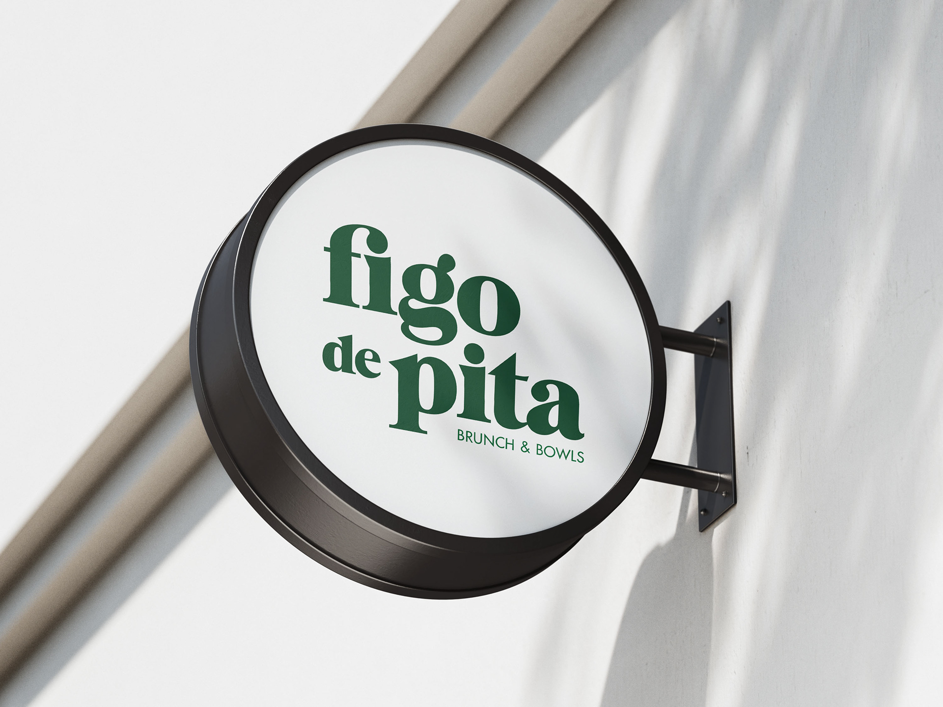
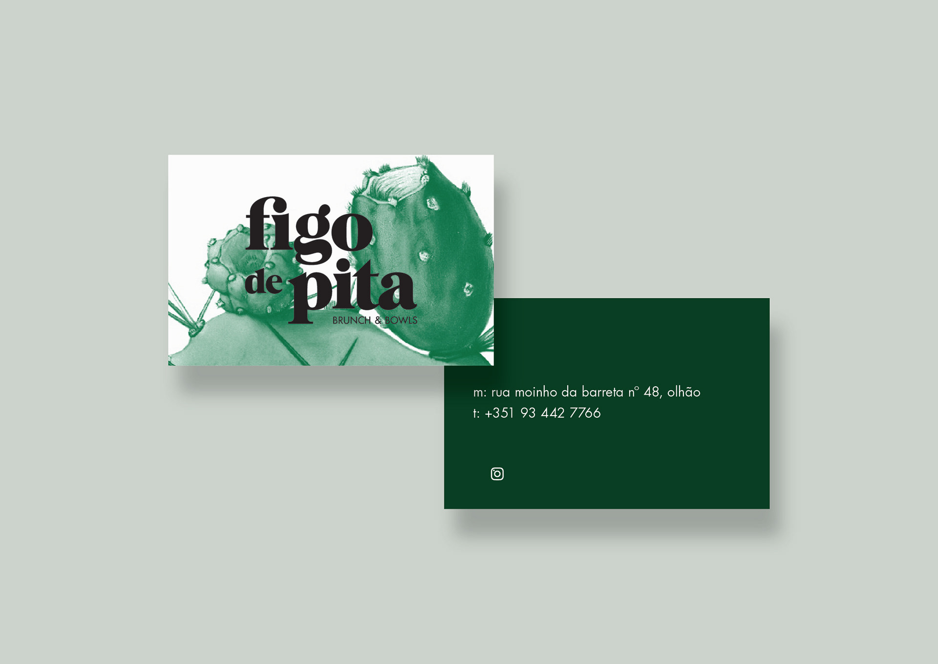
Brand identity developed for Figo de Pita - Brunch and Bowls, a restaurant at Olhão, in the eastern Algarve, with a focus on healthy dishes prepared with seasonal and local products.
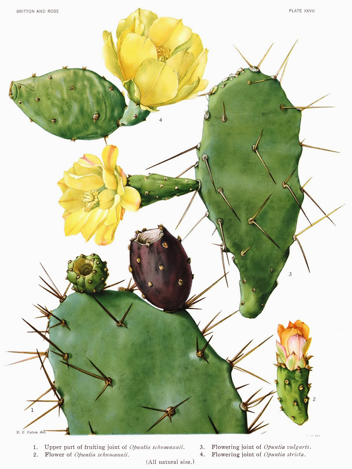
Figo de Pita means Indian Fig (Opuntia Ficus-Indica), a cactus species very common in the Algarve landscape.
Figo de Pita means Indian Fig (Opuntia Ficus-Indica), a cactus species very common in the Algarve landscape.
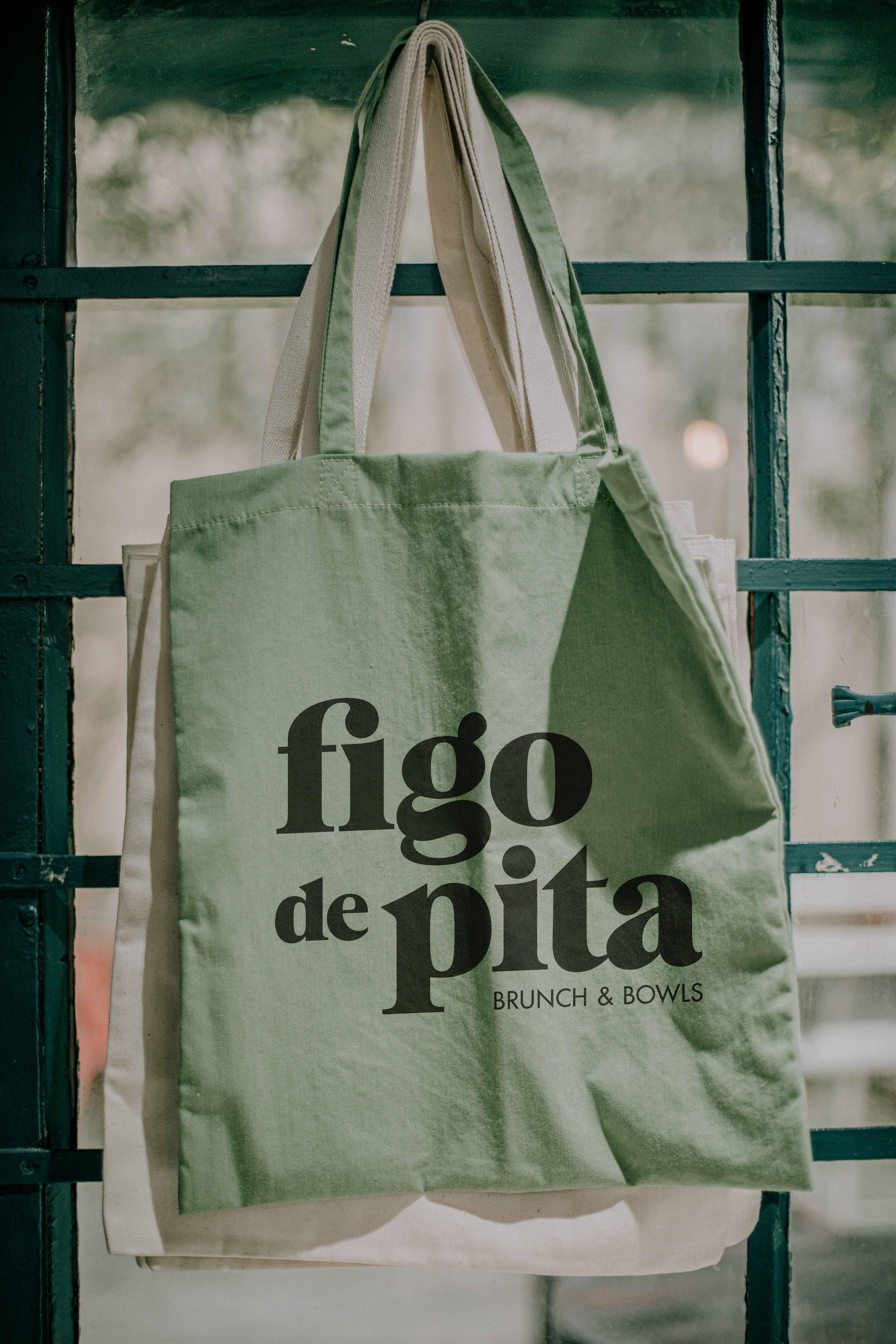
The concept revolves around the Indian Fig anatomy: the typographic logo is created with soft and round curves and has pointy details like
the cactus. It also incorporates the idea of growing in nature with a fun and elegant twist. The brand is fun, fresh and feels connected to the
local landscapes.
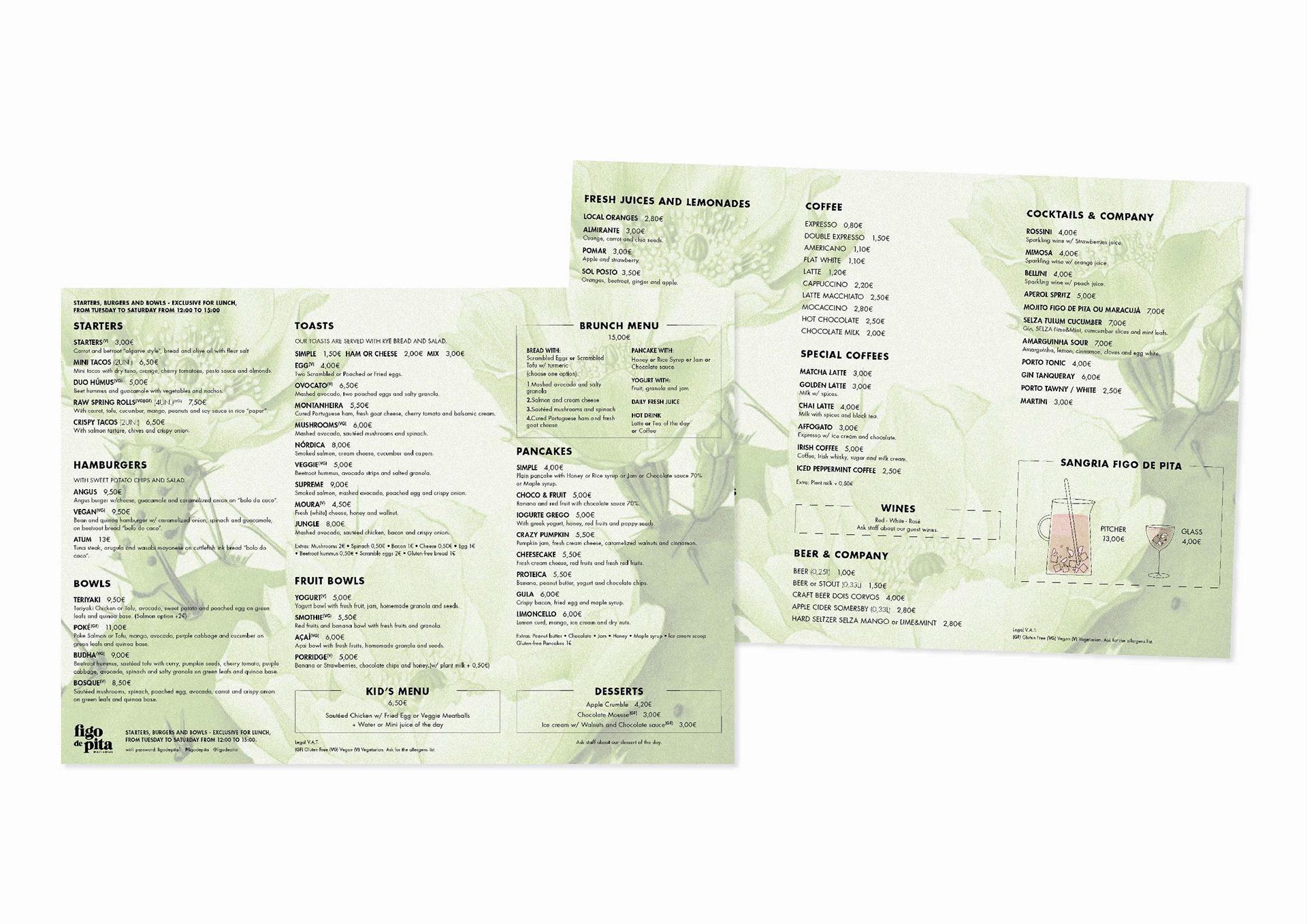
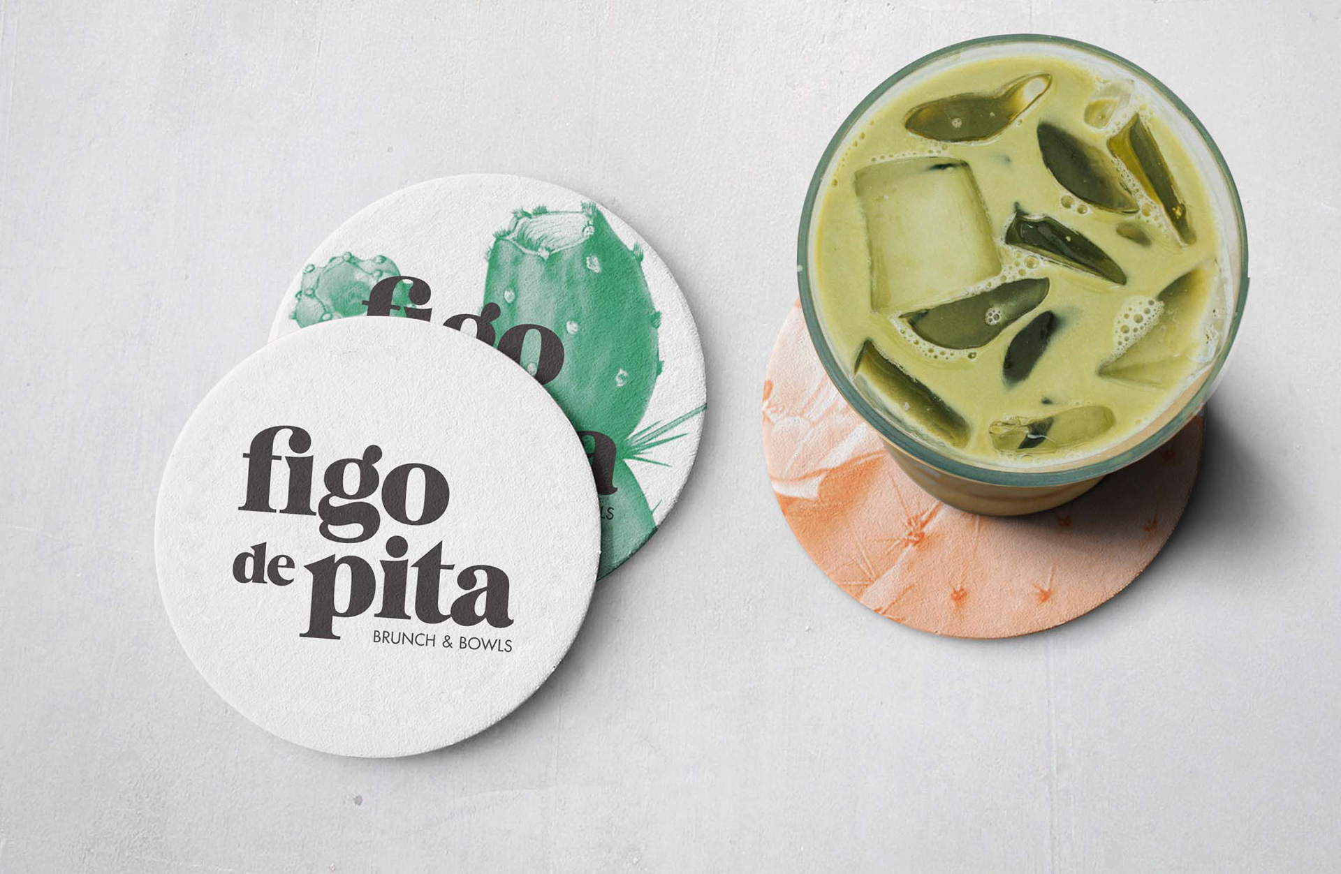
Botanical illustrations were added to the graphic language as a way to add texture and color, and are used throughout the identity and communication materials.
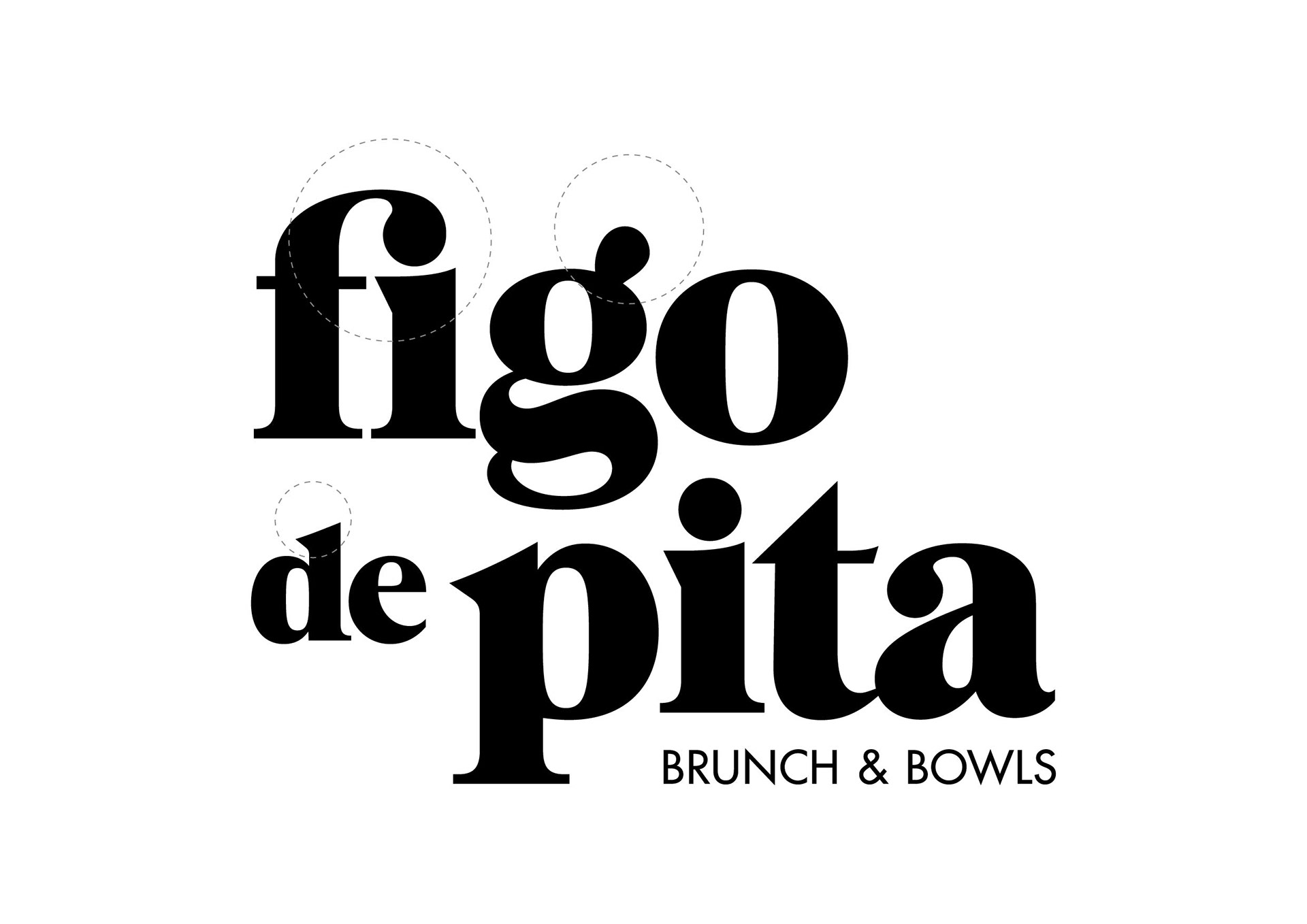
The typographic logo is highly inspired by the anatomy of the Indian fig with soft and round curves and pointy details like the cactus.